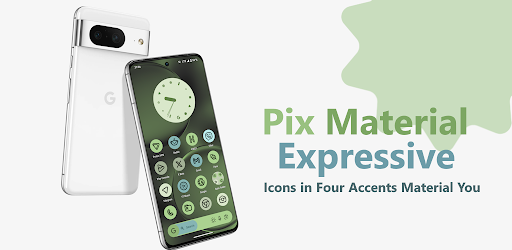
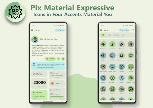
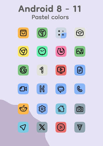
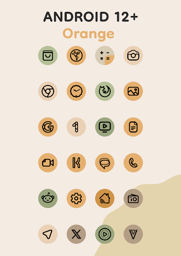
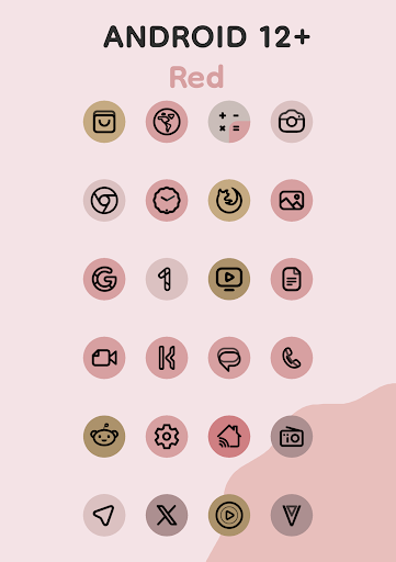
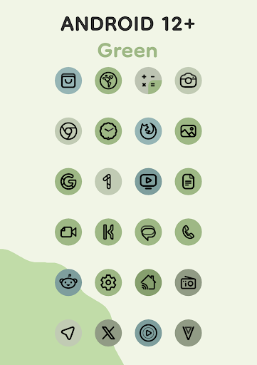
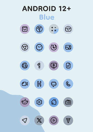
Staring at a chaotic mess of mismatched app icons is basically a crime if you care at all about your phone’s aesthetic. Stock icons are incredibly boring, but this adaptive icon pack completely flips the script. It heavily leans into Material You, but it doesn’t just stop at the basic system settings.
A PROPER MATERIAL YOU EXPERIENCE
They took the standard Monet palette and cranked it up by injecting four extra expressive accent colors. The result? Your home screen actually stands out instead of just blending into a muddy, washed out background.
Every single icon features a super clean, modern linear outline. The backgrounds dynamically shift colors depending on whatever wallpaper you are currently rocking. It creates this beautifully unified look that ties your entire operating system together. Because they are truly adaptive, the icons will actually shift their physical shapes if you use a compatible custom launcher. You get total control over the exact vibe of your phone.
(A quick heads up: The dynamic color shifting relies on the Material You engine. So, if you’re on Android 12 or newer, the icons and widgets will actively pull three colors directly from your wallpaper. If you are stuck on older hardware running Android 8 through 11, the app defaults to a really clean, static set of pastel colors instead.)
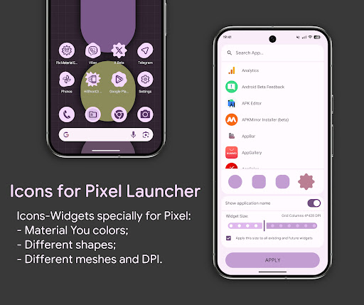
Here is where the developer actually used their brain. A lot of default launchers specifically the stock Google Pixel Launcher straight up refuse to let you apply custom icon packs.
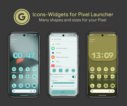
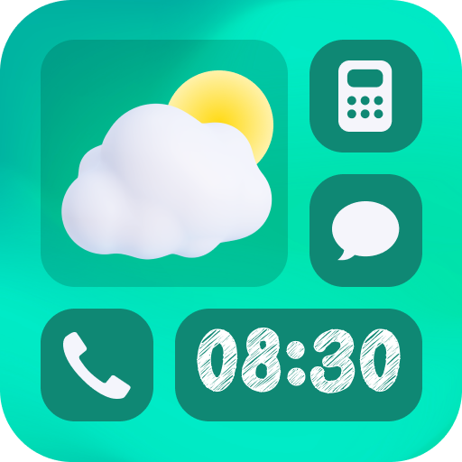
To bypass that incredibly annoying restriction, they built a custom Icon Widget system from scratch. You essentially place a widget on your screen that looks and acts exactly like a standard app icon. It respects your device’s light or dark theme and aggressively pulls colors directly from your current wallpaper. You can tweak the icon shape using Material 3 Expressive guidelines, adjust the label name, and manually scale the size to fit your specific screen grid. It even includes proper launch animations. You are basically forcing fully themed icons onto a launcher that officially hates them.
Adding them is a breeze. Just open your regular widget menu, find the app, pick your target app, choose your shape, lock in your grid size, and hit apply. It just works.
HOW TO KEEP YOUR COLORS SYNCED
There is a slight quirk you need to know about with Android 12+. When you swap your wallpaper, the operating system doesn’t always push the new colors to third party icons instantly. To force the update, you usually need to jump into your launcher settings and simply reapply the icon pack.
However, if you use a smart custom launcher, you can completely ignore that step. The heavy hitters like Nova Launcher (beta 8.0.4+), Smart Launcher, Hyperion, Niagara, AIO, and Stario all handle the color swap automatically behind the scenes.
OVER 24,000 ICONS AND COUNTING
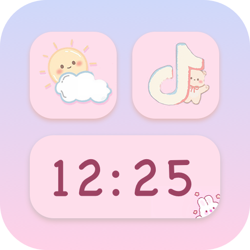
The sheer volume of content you get in this pack is ridiculous. You are looking at over 24,000 individually crafted adaptive icons, meaning almost everything in your app drawer is going to be covered right out of the gate. They also threw in a handful of gorgeous custom clock and music widgets just to round out your setup.
Whether you are running a hyper minimalist setup on Niagara, forcing it onto a stock Pixel via widgets, or tweaking OneUI through Theme Park, this pack is going to completely change how your device feels.